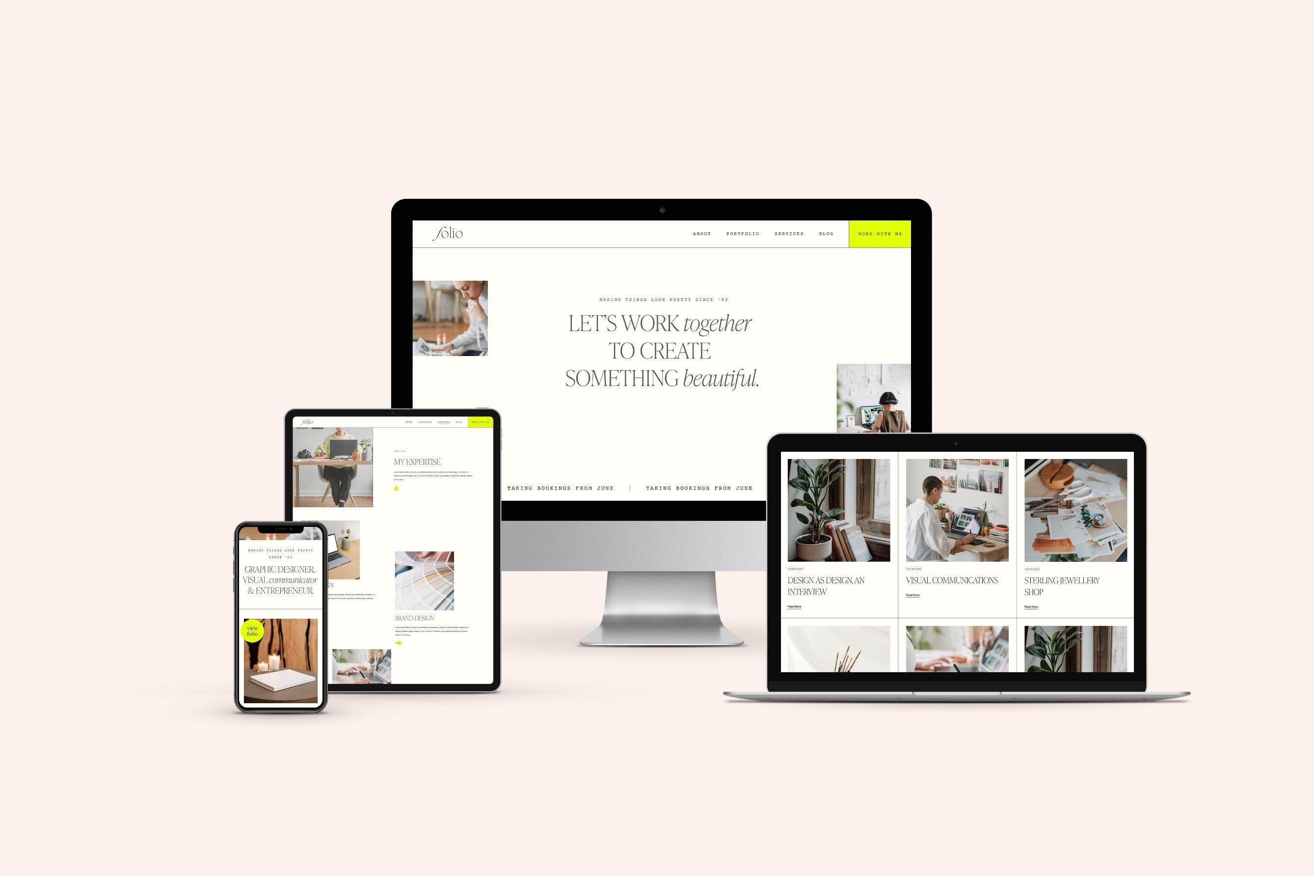
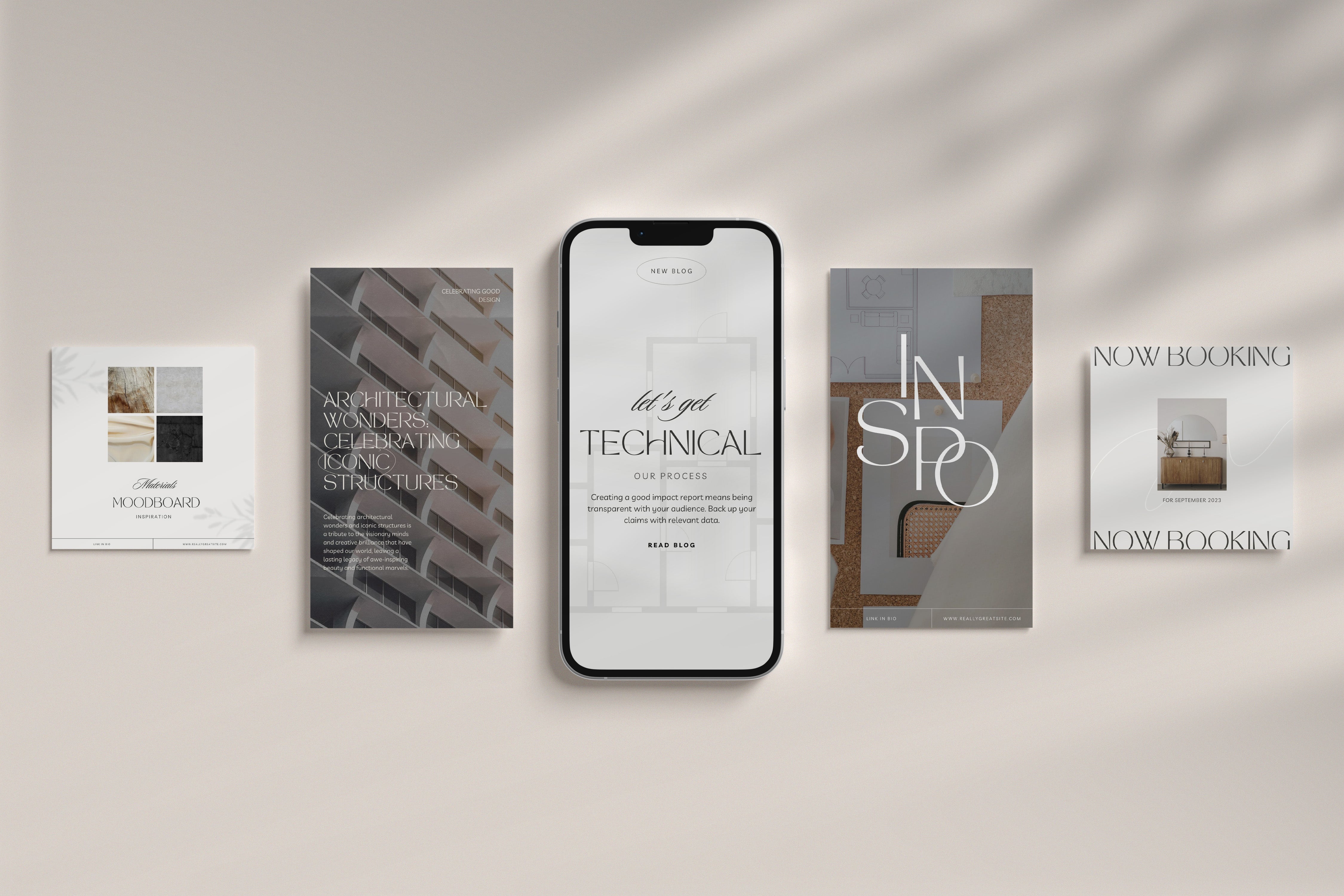
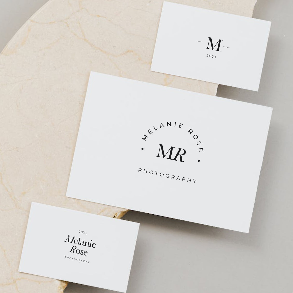
When it comes to designing an attractive and engaging Squarespace website, font selection is sooo important. Sans-serif fonts, known for their clean, modern appearance, have become a popular choice for web design. Fortunately, Google Fonts offers a treasure trove of sans-serif typefaces, including some of the most versatile and well-rounded options.
In this blog, we'll explore a few of my fave free Google Fonts that provide a variety of styles perfect for creating hierarchy and visual engagement on your Squarespace site.
 |
 |
Josefin Sans Regular
Josefin Sans is a contemporary and elegant sans-serif font that's perfect if you’re looking for a font with a little character. Unlike a lot of distinctive fonts, Josefin Sans comes in a variety of weights, from the delicately thin to the bold and impactful.
 |
 |
DM Sans
DM Sans is a classic sans-serif with a modern twist, a font that combines aesthetics with functionality. Its range of weights and perfect legibility make this font a strong choice for text-heavy materials as well as headlines.
 |
 |
Sora
Sora is a charming and stylish sans-serif typeface which also offers a set of weights that can be effectively used in different design contexts. The lighter weights are graceful and delicate, while the bolder weights exude strength and impact.
 |
 |
Jost
Jost is a simplistic yet modern sans-serif font designed for legibility and clarity, and its range of weights allows designers to maintain consistency throughout a project. Jost’s simplicity and readability make it a great choice for editorial and digital design.
Choosing the Right Weight
Selecting the appropriate font weight is crucial for effective design. It can affect the overall tone and impact of your project. Here are a few considerations when choosing the right weight for your text:
- Hierarchy: Use varying weights to establish a visual hierarchy in your design. Lighter weights for body text and heavier weights for headings create a clear structure.
- Contrast: Experiment with contrasting weights to add visual interest and emphasize specific elements.
- Legibility: Ensure that the selected weight maintains legibility, especially in smaller text sizes.
- Branding: Consistency in font weights can reinforce brand identity and recognition.
Conclusion
Google Fonts offer an array of typefaces with different weights to suit your design needs. Whether you're aiming for a minimalist look or a bold statement, the versatility of fonts like these allows you to achieve your design goals effectively. These fonts are exceptional choices whether you're aiming for a minimalist look or a bold statement. Remember to play around with different weights, experiment with layouts, and prioritise readability to ensure your Squarespace website captivates and engages your audience effectively.
Can’t find a Google font on Squarespace?
Don’t panic! We explain how to add custom fonts to Squarespace in our blog.


